library(bayesrules)
library(tidyverse)
library(patchwork)Chapter 3 Beta-Binomial Bayesian Model Notes
The chapter is set up with an example of polling results. We are put into the scenario where we are managig the campaing for a candidate. We know that on average her support based on recent polls is around 45%. In the next few sections we’ll work through our Bayesian framework and incorporate a new tool the Beta-Binomial model. This model will take develop a continuous prior, as opposed to the discrete one’s we’ve been working with so far.
The Beta prior
Tip
a quick note on (1) above. Note that it does not place a restriction on f(\pi) being less than 1. This means that we can’t interpret values of f as probabilities, we can however use to interpret plausability of two different events, the greater the value of f the more plausible. To calculate probabilities using f we must determine the area under the curve it defines, as shown in (3).
x <- seq(0, 1, by = .05)
y1 <- dbeta(x=x, 5, 5)
y2 <- dbeta(x=x, 5, 1)
y3 <- dbeta(x=x, 1, 5)

d <- tibble(
    x,
    `beta(5, 1)`=y2,
    `beta(5, 5)`=y1,
    `beta(1, 5)`=y3
) |>
    pivot_longer(names_to = "beta_shape", values_to="beta",
    -x) |>
    mutate(beta_shape=factor(beta_shape,
                            levels=c("beta(5, 1)",
                                    "beta(5, 5)",
"beta(1, 5)")))ggplot(data=d, aes(x, beta)) + geom_point() +
geom_line() +
facet_wrap(vars(beta_shape))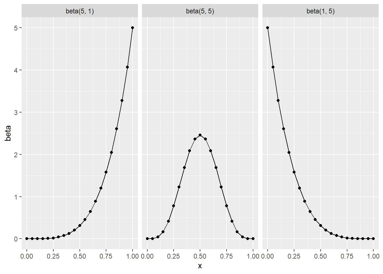
In general the shape of the beta distribution is skewed-left when \alpha > \beta, symmetrical when \alpha = \beta and skewed-right when \alpha < \beta, see Figure 1.
std_unif <- tibble(
    x, `beta(1, 1)`=dbeta(x, 1, 1)
)

ggplot(data=std_unif, aes(x, `beta(1, 1)`)) +
    geom_point() +
    geom_line()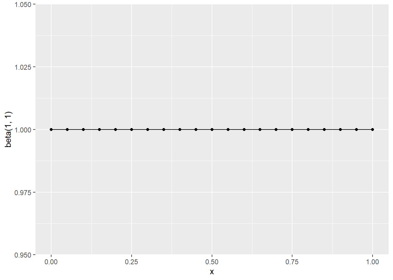
Mean and Mode of the Beta
The mean and mode are both measures of centrality. The mean is average value the mode is the most “common”, in the case of pmf this is just the value that occurs the most in the pdf its the max value.
The formulations of these for the beta are:
E(\pi) = \frac{\alpha}{\alpha + \beta} \text{Mode}(\pi) = \frac{\alpha - 1}{\alpha + \beta -2}\;\; \text{when} \;\;\alpha,\beta > 1
When can also measure the variability of \pi. Take Figure 3 we can see the variability of \pi differ based on the values \alpha, \beta.
beta_variances <- tibble(
    x,
    `beta(5, 5)`=dbeta(x, 5, 5),
    `beta(20, 20)`=dbeta(x, 20, 20)
) |>
    pivot_longer(names_to = "beta_shape", values_to = "beta", -x)

ggplot(data=beta_variances, aes(x, beta)) +
    geom_point() +
    geom_line() +
    facet_wrap(vars(beta_shape))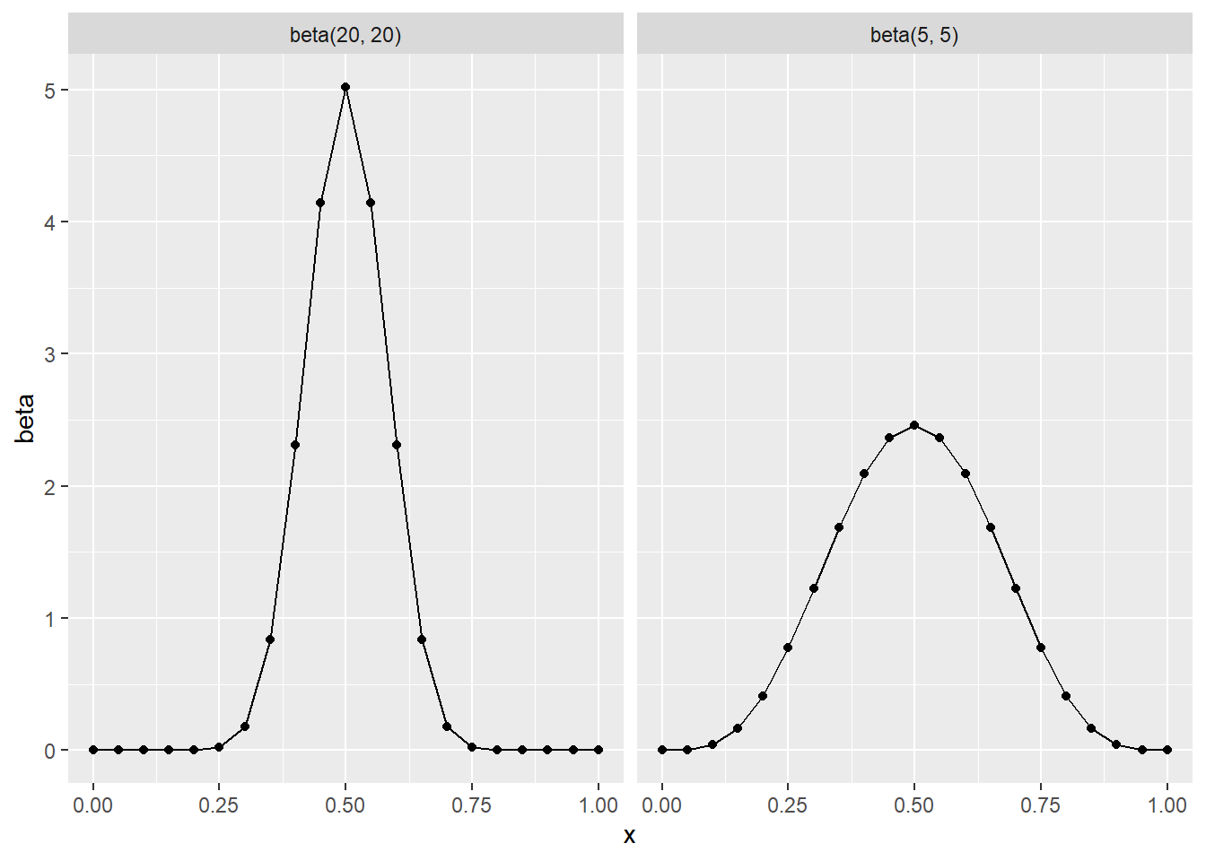
We can formulate the variance of Beta(\alpha, \beta) with
Var(\pi) = \frac{\alpha\beta}{(\alpha + \beta)^2(\alpha+\beta+1)}
it follows that
SD = \sqrt{Var(\pi)}
Tuning the beta prior
Now that we know we can use the beta model to represent \pi for \pi \in [0, 1], what we need to try and do is tune the model so that it best represents our prior. Our options of course are chaning values of \alpha and \beta. We can make use of the fact that we know that on average the candidate is polling at around 45%. That is we know that
E(\pi) \approx .45 \approx \frac{\alpha}{\alpha + \beta}
so I tried to work through the algebra myself, but was unable to do so, the book gets to the following conclusion
\alpha = \frac{9}{11}\beta
p <- plot_beta(9, 11) +
    labs(title="Beta(9,11)") +
    scale_x_continuous(breaks=seq(0, 1, by=.1))
p2 <- plot_beta(27, 33) +
    labs(title="Beta(27,33)") +
    scale_x_continuous(breaks=seq(0, 1, by=.1))
p3 <- plot_beta(45, 55) +
    labs(title="Beta(45,55)") +
    scale_x_continuous(breaks=seq(0, 1, by=.1))

p / p2 / p3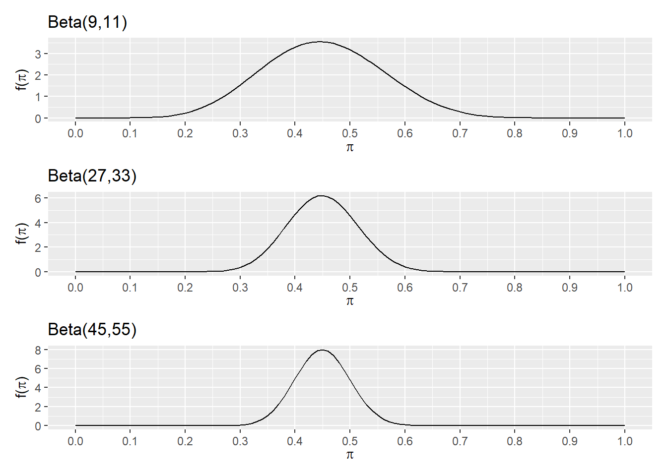
when compared to the original polling values, we can see that the closest of these is Beta(45, 55)
we can get the pdf, and then mean, mode and variance of the pdf.
f(\pi) = \frac{\Gamma(100)}{\Gamma(45)\Gamma(55)}\pi^{44}(1-\pi)^{54}
E(\pi) = \frac{45}{45 + 55} = .4500 \text{Mode}(\pi) = \frac{45 - 1}{45 + 55 - 2} = .449 SD(\pi) = .05
rb1 <- rbinom(10000, 50, .2)
rb2 <- rbinom(10000, 50, .3)
rb3 <- rbinom(10000, 50, .5)
rb4 <- rbinom(10000, 50, .6)
rb5 <- rbinom(10000, 50, .7)
rb6 <- rbinom(10000, 50, .8)

results <- tibble(
    `Bin(50, .2)` = rb1,
    `Bin(50, .3)` = rb2,
    `Bin(50, .5)` = rb3,
    `Bin(50, .6)` = rb4,
    `Bin(50, .7)` = rb5,
    `Bin(50, .8)` = rb6,
) |>
    pivot_longer(names_to = "bin_model", values_to = "value",
    `Bin(50, .2)`:`Bin(50, .8)`) |>
    mutate(is_30 = value == 30)

results |>
    ggplot(aes(value, fill=is_30)) + geom_bar(stat = "count") +
    scale_fill_manual(values = c("grey30", "darkblue"), guide="none") +
    facet_wrap(vars(bin_model))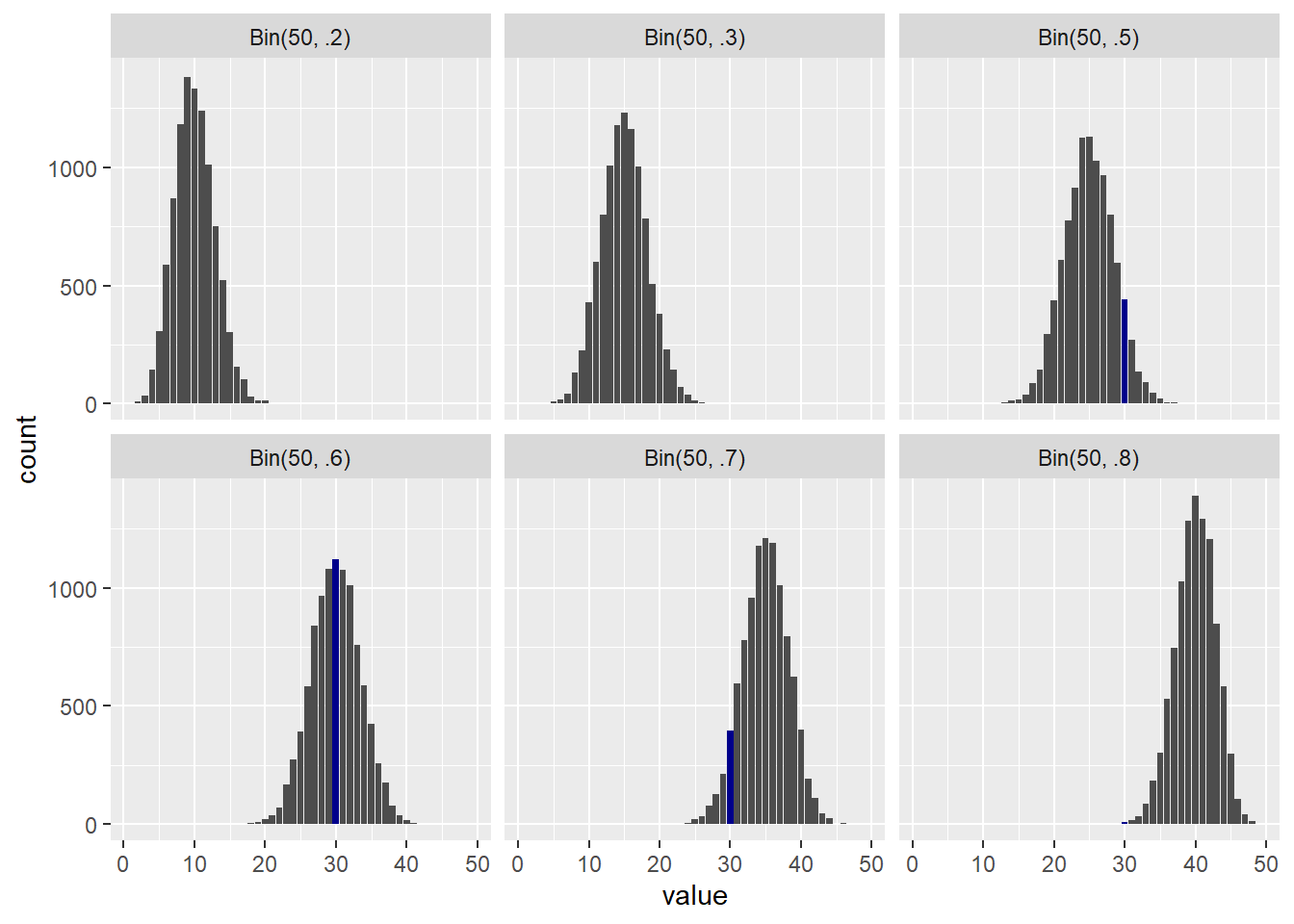
After the finish the poll, we see that the actual value of Y is 30. The vertical line in Figure 4
results <- tibble(
    ys = 1:50,
    `beta(50, .1)` = dbinom(x = ys, size = 50, prob = .1),
    `beta(50, .2)` = dbinom(x = ys, size = 50, prob = .2),
    `beta(50, .3)` = dbinom(x = ys, size = 50, prob = .3),
    `beta(50, .4)` = dbinom(x = ys, size = 50, prob = .4),
    `beta(50, .5)` = dbinom(x = ys, size = 50, prob = .5),
    `beta(50, .6)` = dbinom(x = ys, size = 50, prob = .6),
    `beta(50, .7)` = dbinom(x = ys, size = 50, prob = .7),
    `beta(50, .8)` = dbinom(x = ys, size = 50, prob = .8),
    `beta(50, .9)` = dbinom(x = ys, size = 50, prob = .9),
) |>
    pivot_longer(names_to = "beta_model", values_to="value", -ys) |>
    mutate(
        is_30 = ys == 30,
        pie = rep(c(.1, .2, .3, .4, .5, .6, .7, .8, .9), 50))

results |> ggplot(aes(ys, value, fill = is_30)) +
    geom_col() +
    scale_fill_manual(values = c("darkgray", "darkblue"), guide="none") +
    facet_wrap(vars(beta_model))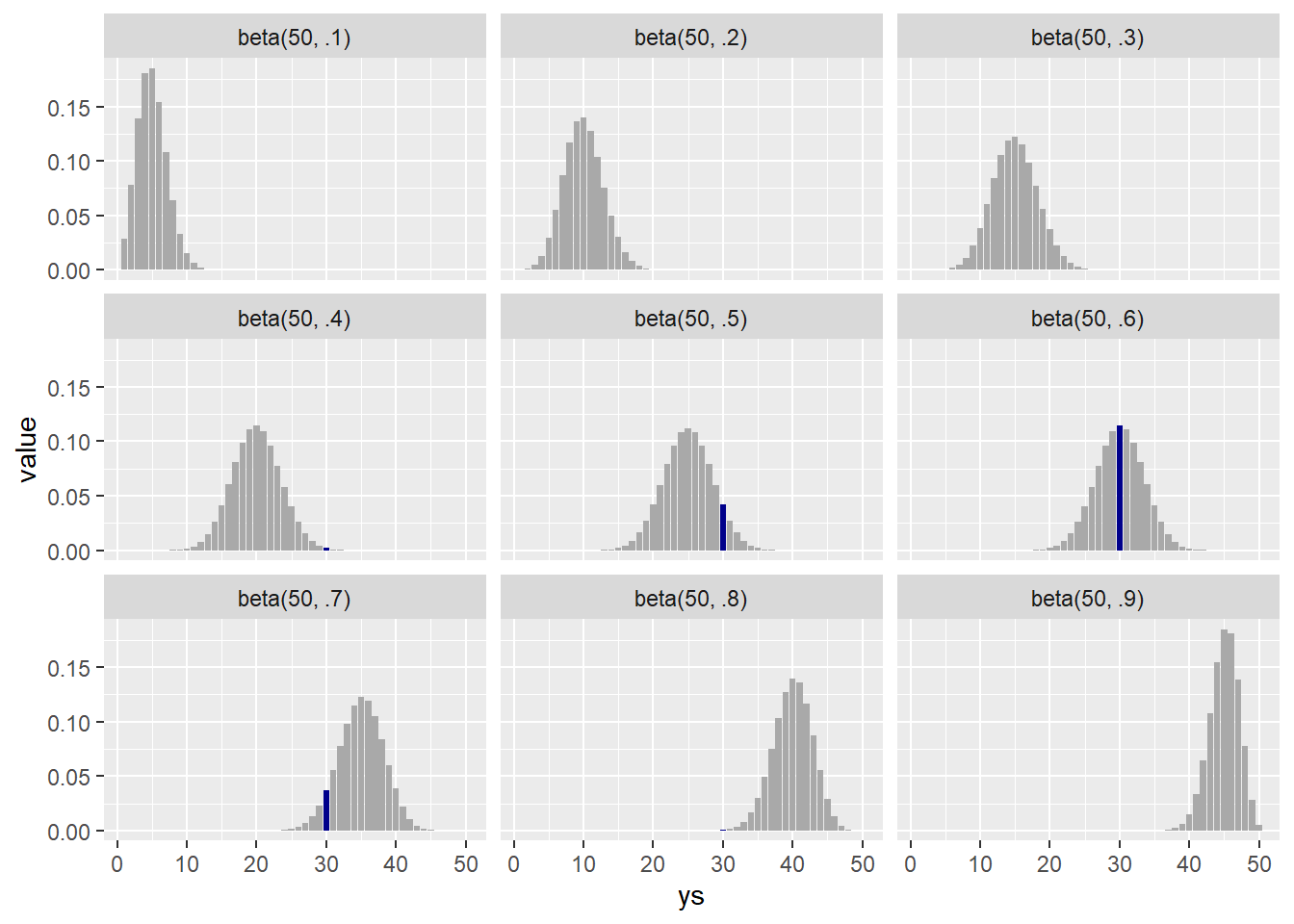
results |>
    filter(is_30) |>
    ggplot(aes(pie, value)) + geom_col() +
    scale_x_continuous(breaks = seq(.1, .9, by = .1))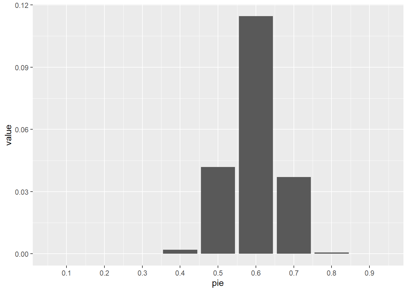
summarize_beta_binomial(alpha=45, beta=55, n=50, y=30) model alpha beta mean mode var sd
1 prior 45 55 0.45 0.4489796 0.002450495 0.04950248
2 posterior 75 75 0.50 0.5000000 0.001655629 0.04068942Simulation
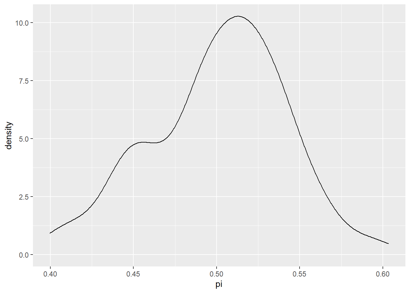
In this simulation we first generate 10,000 random values from a beta distribution with parameter \alpha = 45, \beta = 55. Recall, that this is what we believe to be support based on recent polls for the candidate, and therefore our prior. We use each one of these are the prob value (the \pi value) into 10,000 more random this time from the binomial distribution with n = 50. This binomial distribution is the model for Y conditioned on \pi.
sim <- tibble(
    pi = rbeta(10000, 45, 55)
) |>
    mutate(y = rbinom(10000, size = 50, prob = pi))
sim |>
ggplot(aes(pi, y)) + geom_point(aes(color = (y == 30))) +
scale_color_manual(values = c("darkgrey", "navyblue"))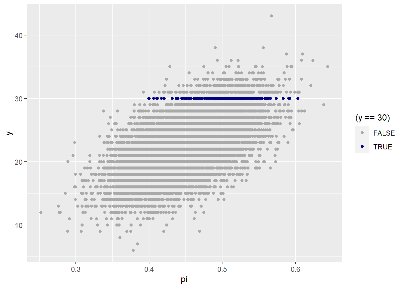
sim |>
    filter(y == 30) |> # the posterior
    ggplot(aes(pi)) + geom_density()